[smartads]
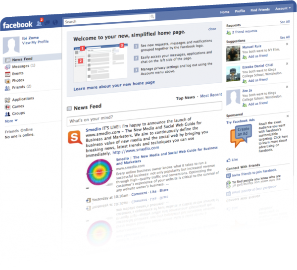
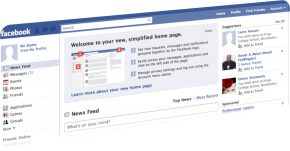 Facebook started rolling out its new design to users this week. This new design is not currently available to all users yet; it’s a great improvement over Facebook 1.0. The new design is targeted more toward updates than any thing else.
Updates to the To Menu
The Home, Profile, Find Friends links, and Account menu, which include your Edit Friends, Account Settings, Privacy Settings, Application Settings, Credit Balance (this is an interesting one), Help Center, and Log Out options, are now relocated to the top-right corner. Notifications updates such as someone writing on your wall or tagging you in a photo, requests and messages are now placed in a bubble near the search bar on the top left menu. This notifications are wrapped in a drop-down menu with your recent notifications appearing at the top.
Content Navigation
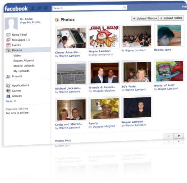
For easier communication and access to content from friends, messages and other essential features like events, photos – which contains the video, recent albums, mobile uploads, and my uploads drop-downs, have now been organized to the left of the news feed.
The Chat bar is still located at the bottom right corner of your browser but it has been made more prominent by showing some of your online friends. To see all your friends online, you just click “See All” or expand the Chart bar.
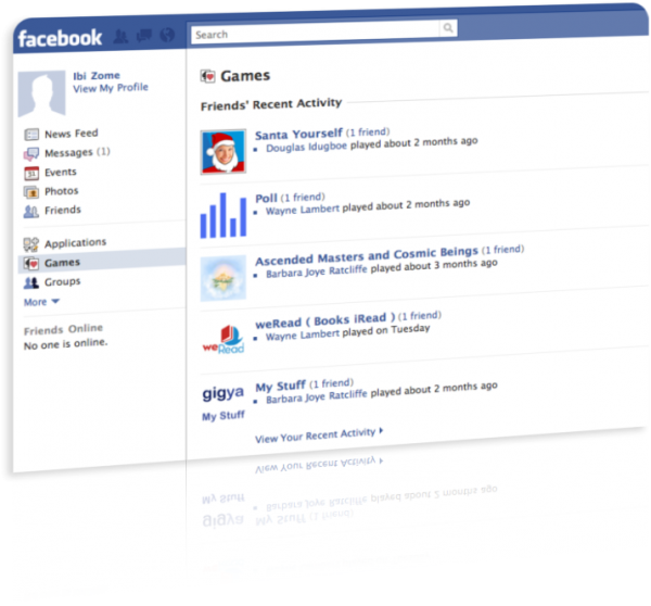
A couple of changes have been made around Games and Applications as well.
What do you think of the new Facebook design?




I was really worried about the new Facebook design when I first heard about it. I imagined that most people would hate the redesign considering every time Facebook makes a change, more than half of its users melt down emotionally and threaten to leave. But the redesign actually makes the Facebook experience better. I feel like there's much more available to me with a lot less clicks than before. Overall, I think most people are actually enjoying this change.
You're very right Jay about most people liking this particular change in design. Usually a change in design in many platforms would mean having to re-lean the interface but this one is really easy on the eyes and user friendly as well. It brings even more value to the platform.
I simply want to mention I am just very new to blogs and really liked your web-site. More than likely I’m want to bookmark your blog post . You absolutely have excellent stories. Kudos for sharing with us your web-site.
I believe one of your advertisements caused my web browser to resize, you might well want to put that on your blacklist.
I experimented with viewing your blog on my cellphone and the structure does not seem to be right. Might want to check it out on WAP as well as it seems most smartphone layouts are not really working with your web page.
The design for your site is a bit off in Epiphany. Even So I like your web site. I may have to use a normal browser just to enjoy it.
Have you considered including several social bookmarking links to these blogs. At the very least for youtube.
This is often a amazing blog, could you be interested in going through an interview about just how you designed it? If so e-mail myself!
I have got one idea for your weblog. It appears like right now there are a handful of cascading stylesheet problems while launching a number of webpages within google chrome and safari. It is working alright in internet explorer. Possibly you can double check that.
When are you going to post again? You really inform me!
Another thing is that when you are evaluating a good on the net electronics shop, look for online shops that are continuously updated, keeping up-to-date with the newest products, the top deals, along with helpful information on goods and services. This will ensure you are handling a shop which stays ahead of the competition and provides you what you need to make educated, well-informed electronics acquisitions. Thanks for the important tips I have really learned through the blog.
After I start your Rss feed it appears to be a lot of junk, is the issue on my side?
Have you considered adding several social bookmarking buttons to these blogs. At least for myspace.
I experimented with taking a look at your website in my new iphone 4 and the page layout does not seem to be right. Might want to check it out on WAP as well as it seems most smartphone layouts are not working with your website.
This blog has got lots of very useful stuff on it. Cheers for sharing it with me!
I love the website layout . How do you make it? Its very sweet.
Amazing article, thank you, I will visit again now!
Have you given any consideration at all with converting your web-site in to German? I know a few of translaters here that would help you do it for free if you want to contact me.
Good Stuff, do you currently have a bebo account?
Have you considered adding a few social bookmarking links to these sites. At the very least for facebook.
While I truly like this publish, I believe there was an punctuational error near to the end of the 3rd section.
Many of the responses on this particular blog site dont make sense.
Many of the opinions on this particular blog site dont make sense.
Just discovered this site thru Google, what a way to brighten up my week!
How do you make this blog look this sick! Email me if you want and share your wisdom. .
Easy Methods To Grow Hair Efficiently As Well As The Fastest Way Doable