


A landing page is the door to a prospect’s wallet. If there’s one question a digital marketer dreads, it’s “What’s your increase in conversions? In a business where advice about what to do and what not to do to get better sales, get more email signups, encourage more downloads and so on abound everywhere you turn; what do you really do to make a difference to your business?
I would go so far as to say, there are some truly terrible pieces of advice that many marketers still use as guiding stars on the path to ultimate glory – improved conversions. Here’s my pick of the top five toxic ones.
The right color / size buttons will transform your business landing page
This is probably the most commonly bandied about misconception about landing page conversion rates. The average CRO professional would have you believe that by simply making your call to action button a little bigger, your conversion rates will drastically improve. Yes, better visibility does make a difference in how many visitors end up noticing and clicking on your CTA, more than size, it’s the location of your CTA that matters more.
Michael Agaard demonstrates exactly this in his detailed article on A/B testing for CTA buttons.
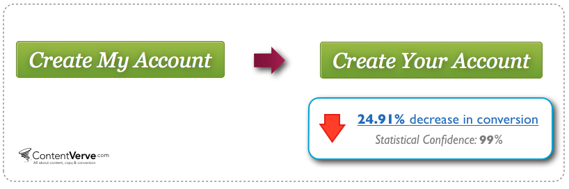
In the article he demonstrates how an increase in button size for a client actually resulted in a drop of conversions by 10%.
From using color theory to going by good ol’ gut feel, bright buttons are supposed to be the game-changer for landing page optimization. Again, this is only addressing half the story. A bright, flashing orange button on the best designed landing page is useless, if its call to action is worded all wrong.
Your homepage can double as your landing page
If you sell just one product and it has just one keyword that users use to find it; then and only then can you consider using your homepage as your landing page. Since this is not true for most businesses in the real world, cutting corners by reusing your home page as your landing page is a seriously penny-wise, pound-foolish move.
Instead, spend dedicated amounts of time discovering all the keywords a potential user may have used to arrive on your site. Even a free tool like the KeyWordTool.io offers you a range of potential keywords that can be used to improve conversions. For a product category like ‘selfie stick’ keywords can range from ‘selfie stick ban’ to ‘selfie stick ebay’ to even ‘selfie stick doesn’t work’. With landing pages dedicated towards your best performing keywords, you can make your pages more relevant to users.
Getting a developer is the only way to an effective landing page
Superior quality and endless customization are the twins platforms which web designers have been using for years, to force business owners into forking over big sums of money for pretty average looking websites. However, all of that is quickly turning redundant. With the number of extremely sophisticated DIY website builders now at your fingertips you save critical budgets on things that matter more.
Even if you want to stick with the a dedicated web designer for your website, it makes a whole lot of sense to opt for a free landing page builder like Spaces that can be used to churn out multiple versions of landing pages for different keywords. Multiple factors weigh in towards DIY landing page tools over dedicated designers like,
- With no coding skills needed, DIY landing page builders help you create and roll out quick response campaigns that are nimble on their feet – something that no web designer can hope to match.
- Detailed analytics available instantly for each of your landing pages, is another critical input that your web designer can’t offer.
- Their cost differential. Most landing page makers are way cheaper than the average web designer – something that can prove a huge drain on your resources in a multiple landing page scenario.
Human images improve conversions
A common piece of advice you hear about website design is to use images across your site to grab attention and user interest. According to various pieces of research, the human brain possesses images quicker than text, making great online images a necessity. Among images that work well, we’re told are images with people – smiling, happy ones – are the moneymakers. This ‘human faces equals better conversions’ tip has been repeated so often that this test by Anthem took me by complete surprise.
According to WhichTestWon, health insurance provider Anthem found that the exact opposite was true in their case.
Version A Version B
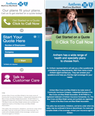 In the case above, Anthem found that the version without the smiling lady actually got 166% more leads than the one with the image. Moral of the story? Even if human images re more interesting and definitely grab the eye on a landing page, using them willy-nilly can be counterproductive. By dropping the large image in Version B, no-image version gets more space to offer users a clear choice of action.
A well optimized landing page is key to a flourishing business
Yes, landing pages are critical to conversions. There’s no arguing that fact. However, pinning the entire responsibility of your businesses growth and development on great landing pages is naïve to say the least.
A successful business also has a ton of other things going for it. An extremely nuanced UX across the site matters. Customer service is critical in determining whether the user will return or not. The product itself needs to be stellar for users to patronize it over hundreds of other (often cheaper) competitors.
In other words, landing page conversion optimization is a drop in the ocean of marketing a business. From attracting the right leads to offering the best customer care, there are a whole bunch of other factors that contribute to your success none of which ought to take complete precedence over the others.
Over to you
Yes, landing pages are the holy grail of conversion optimization, but the trouble with all this advice surrounding landing page optimization is that it is very often anecdotal. Very few pieces of advice can be picked up and applied to your situation blindly. So, always take what you read on online blogs with a pinch of salt. Test everything and make sure you know exactly what works for you and what doesn’t.
[et_social_share]
Hi Sabastien, Great post. I just spoke with someone who has just implemented an analytic programme. She’s really into tracking everything and optimizing every single inch of the webpage. It really is too bad that people forget the bigger picture and optimize small things.